
Our approach
Regulation, transparency, trust: the foundation of fintech UX
Why design work in fintech breaks when these layers are treated as constraints instead of the base, with practical checklists for teams.

Pavel Chelyuskin
Founder
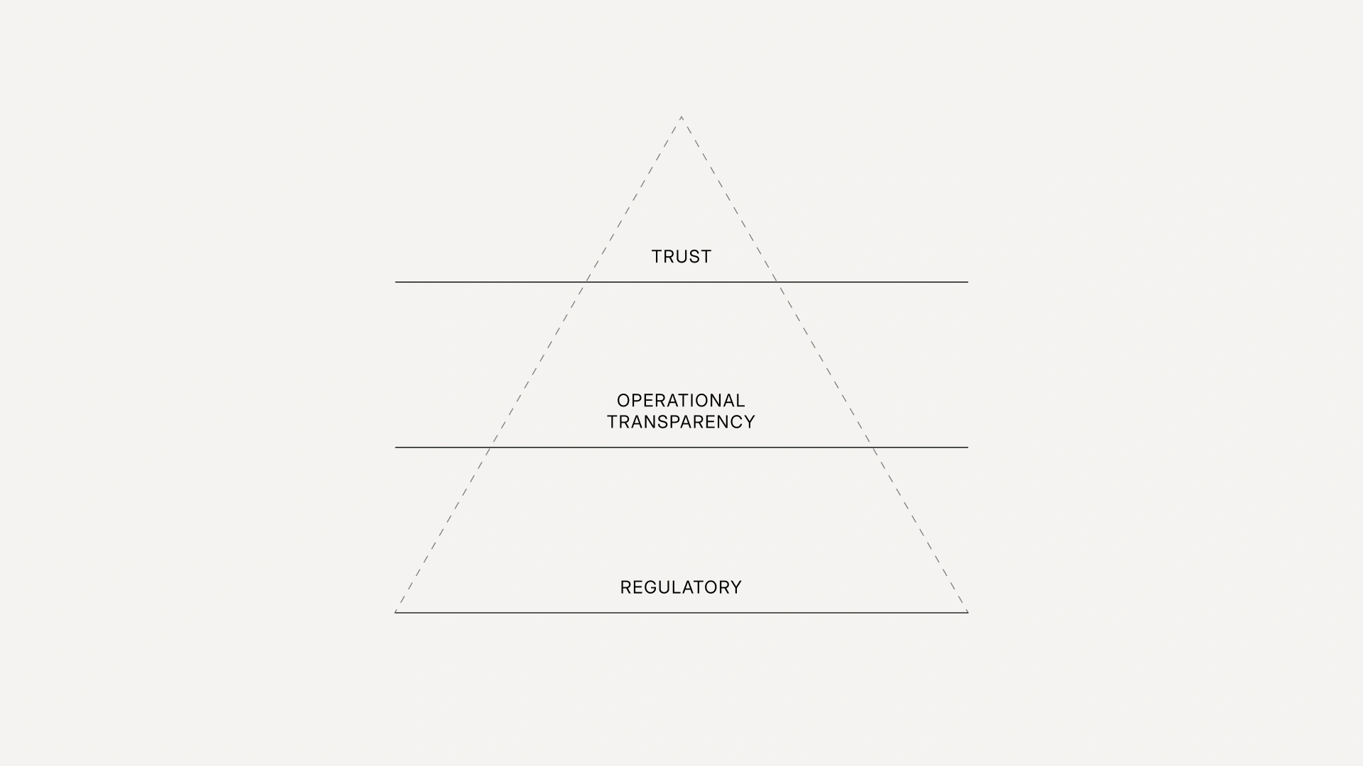
Three foundational layers we build UX on for fintech products:
- Regulatory layer
- Operational transparency
- Trust
Without them, any design work in fintech is just UX on top of nothing.
1. Regulatory layer
Sign-up, transfer, lending, card linking — every flow has its own regulator's requirements: KYC, SCA, AML, transaction limits, etc.
Regulatory requirements are worth baking into the foundation of the flow — otherwise they get retrofitted, and that means: a) suboptimal UX with poor conversion; b) extra development costs; c) risk of fines from the regulator.
There are plenty of examples where companies treated regulatory constraints as a foundation rather than a set of obstacles — and won a competitive edge from it.
Monzo didn't just ship video-KYC — they came up with a phrase the user says on camera: "My name is •••••, and I want to open a Monzo account". It closes the FCA identification requirement, works as a trust signal, and became a signature feature of the bank, which now has 15M customers.
Wise Business embedded the source-of-funds request directly into the transfer flow — documents don't need to be uploaded in advance, only when a specific payment requires them.
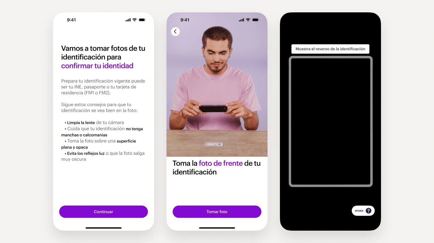
Nubank shows an animation of how to photograph a document and take a selfie correctly, and then matches the image against the shared biometric database of Brazilian banks and retailers — Unico. The identification requirement turned into an anti-fraud layer that works for the entire industry — and helped Nubank grow to 131M customers by the end of 2025.
What's worth doing in practice:
First. Put together a checklist of questions for legal before pulling a flow into work:
- what's the minimum data set to collect at sign-up, and what can be deferred;
- which thresholds trigger additional checks, and where this is documented;
- what to do when the automated scoring flags a user — reject silently or explain.
Second. Run a regulatory-layer checkup and verify that:
- the team can quickly answer which regulatory requirements are covered by the current mockups (this should be documented);
- legal copy went through lawyers, not marketing;
- there are no compliance-tagged tickets older than a month in the backlog;
- it's clear which changes require legal sign-off and which can ship without it.
The regulatory layer doesn't break because lawyers are dry and designers are creative. It breaks when they meet over the mockups, and the flow is already locked, and nothing fundamental can be changed anymore.
2. Operational transparency
Here's what an international transfer looks like at one of my banks:
- Fill in all the required details and confirm with an OTP;
- A pause follows in which nothing happens — money isn't debited, the bank sends no notification;
- I email my personal manager at the branch to mention that I have, in fact, submitted a transfer;
- The manager does something, and usually within 24 hours the money goes out via SEPA (a system designed to make payments arrive in minutes);
- After I get an SMS that the money has left the account — I wait another day and then ask the recipient whether it arrived.
This is what poor operational transparency looks like. Compare it, for example, to courier delivery, where the courier with your parcel can be tracked almost in real time. A parcel is a physical object moving through the real world across dozens of handoff points. Money is a record in a database that knows its status at every moment. The paradox is that in 2026 it's easier to track a parcel than a transfer.
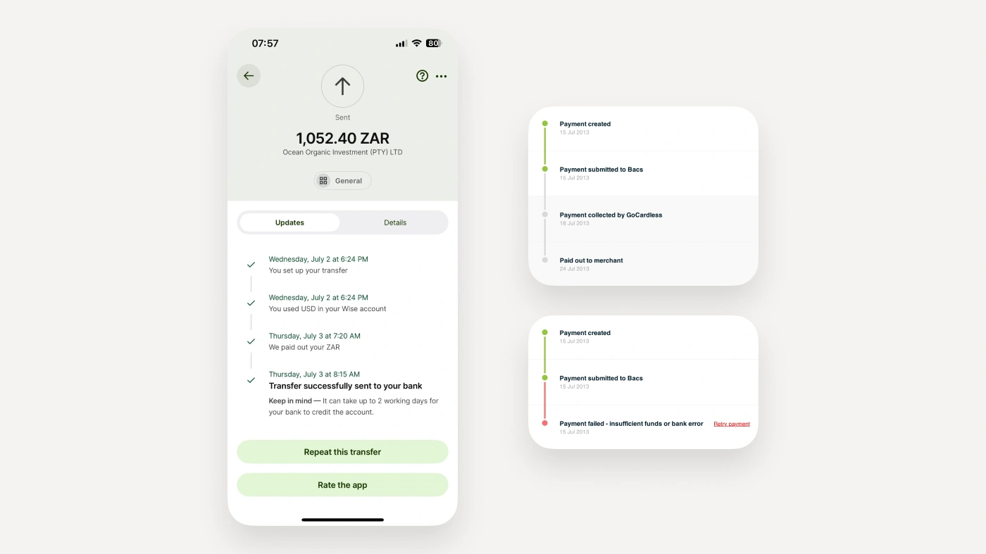
Wise can be considered the benchmark for transparency — both in total cost and across the entire operational layer. Here's an example of their transfer timeline. GoCardless uses a similar approach.
The hard counter-example — Robinhood. A user saw a −$730K balance in the interface. It was an intermediate state of an options settlement, no actual debt existed. But the UI didn't show that, and instead of support — only a templated reply. The story ended in tragedy, a lawsuit from the family, and the largest fine in FINRA's history — $70M.
Robinhood is an extreme case, but the mechanics are the same everywhere. Most fintech products are built on the interaction of multiple systems, and a user's journey has many points where the process can stall, break, or take an unexpected path.
Transfer statuses, timeouts, partner-bank errors, scoring rejections, partial settlements, reversals, FX discrepancies, "stuck" transactions — each of these states will occur at some point, and it matters what the user sees in that moment.
Without an answer to this question, the consequences don't take long to show up:
- Higher support load;
- Loss of trust after the very first failure (regaining trust, as is well known, costs more than earning it);
- Reputational risk — a single viral thread about money disappearing for three days erodes trust even among people who were never customers.
Designing the status model, entry and exit points, and realistic timeouts is an essential part of good UX.
Rendering this in Figma mockups is boring, and these situations never surface in demo mode — which is why the work consistently gets pushed to "later".
This should be designed into the feature itself, as part of the product, not filed away in the backlog as corner cases.
What this looks like in practice
Before taking on a new flow:
- What states can be between initiation and final status? What types of errors are possible?
- What are the SLAs of the systems involved, and how should that be communicated to the customer?
- Who owns customer communication during incidents — product, marketing, or support?
An operational layer check-up for existing flows:
- It's worth verifying that pauses are filled correctly: 2 seconds, a minute, a day — these are entirely different interface behaviors. Check whether there's a one-minute pause where 2 seconds were assumed, and so on;
- All recurring error types should be handled properly. User mistakes are best prevented upfront, while system errors should tell the user what to do next;
- Make sure every exit from the flow is covered: the user may close the window or even the app, or a system error may leave the flow hanging — think through how to bring the user back into the flow without starting over;
- The status model in the product, the backend, and support should match (meaning support sees what the user sees).
The quality of a fintech team isn't tested on the happy path. It's tested in the minute when something goes wrong for the user.
3. User trust
Many studies show that finance is the area where user trust is decisive. A user will sooner choose a service with a higher fee if it's a service they trust.
It's no accident that many regulations require interfaces to be built to inspire trust — to explain and disclose everything that matters. If operational transparency is a property of the interface — the system correctly reports its own state — then trust is a property of the relationship: the customer is willing to act without checking.
Transparency can be closed formally — the statuses are there, the copy is written, all good. Trust is tested when the interests of the user and the service diverge. The practical sign of trust is an interface that sometimes acts against its own revenue.
A. Full disclosure
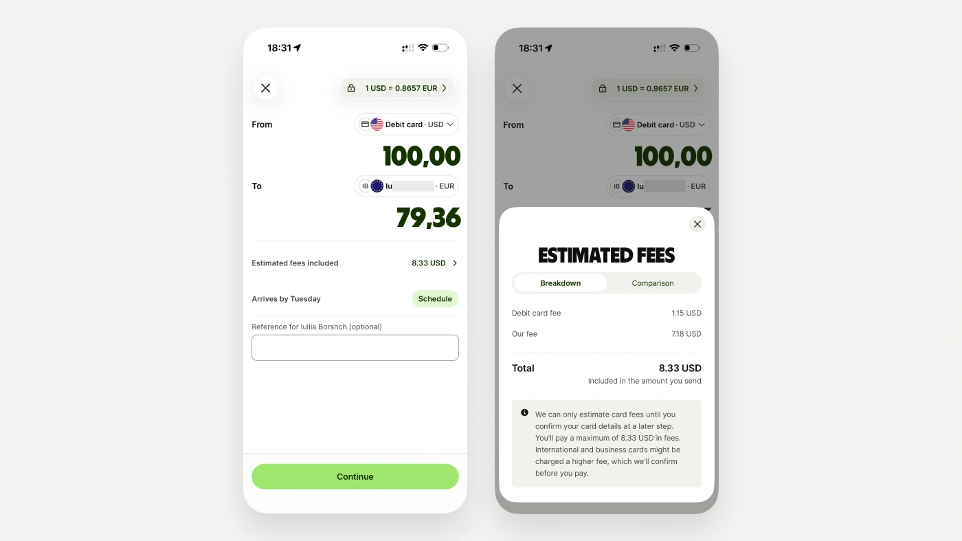
The fee is shown in full and before the transaction, ideally on the amount entry screen. If it's made up of several components — a third-party fee, currency conversion — all of them are shown. Hiding an extra fee in the exchange rate is bad form.
Wise shows the fee on the amount entry screen, uses the mid-market rate with no markup, and states right there how much the recipient will get. The full price list is also published on the website.
Sometimes a fee structure simply "won't design". In those cases the answer may be to change the product itself. Two examples of how Wave and Atlantic Money dealt with complex fees.
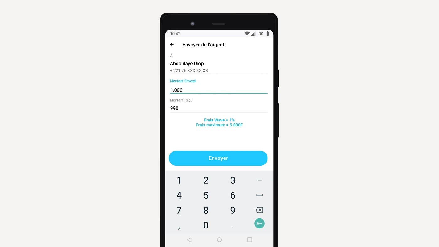
Wave (Senegal) introduced a flat 1% fee on transfers, while local operators had a complex tariff grid of 5% to 10%. Competitors reacted quickly and cut transfer costs by almost 80%.
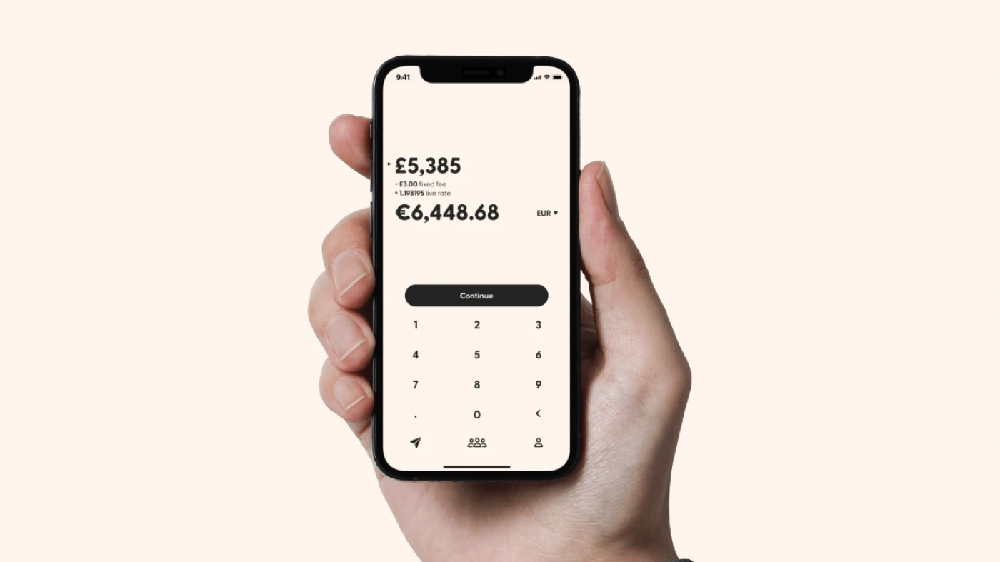
Atlantic Money (UK) took the idea to its limit: a fixed price for a transfer of any size. Express delivery, however, costs an extra 0.1%.
Agreement terms live in the interface, not only in a 30-page PDF.
A credit product's payment schedule answers "when", "how much", "what it consists of" and "what happens if I don't pay on time" — before signing, not at the moment of delinquency. Good practice is to warn about payments and auto-debits in advance and on the day of payment.
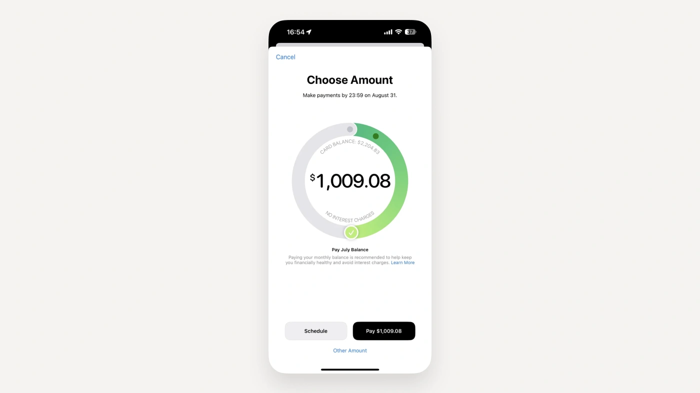
Apple Card shows the cost of credit right inside the control used to choose the payment amount.
The user's language, without dumbing it down. "You don't have enough money", not "insufficient funds available on the account balance". Terms that can't be avoided are explained right next to them — in a tooltip, for example.
B. Customer protection
Features that reduce revenue but increase trust.
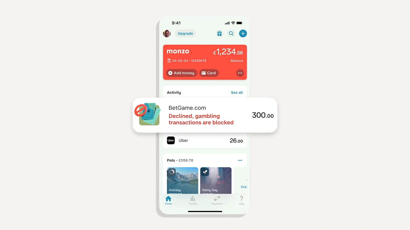
Monzo added a self-imposed block on payments to gambling merchants in 2018. It switches on instantly and switches off only after a cooling-off period the user chooses themselves. Another feature: when a user gets a call "from Monzo", they can open the app and see whether a real conversation with an employee is taking place.
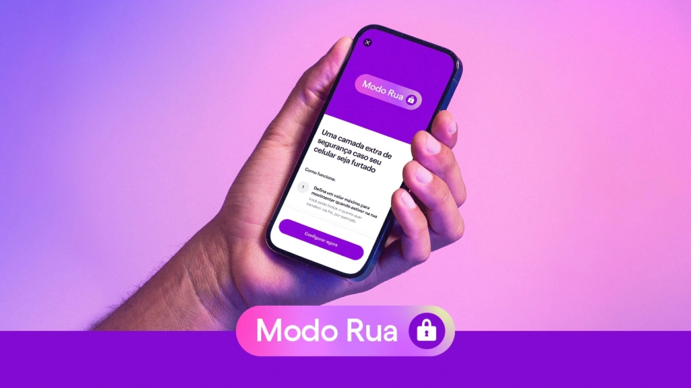
Nu ran a security survey and found that before leaving home, customers log out of the app and lower their card limit, and some even left their smartphone at home and carried a second one. The response wasModo Rua (Street Mode): the user picks trusted Wi-Fi networks, outside of which the app caps transfer amounts and requires Face ID above the limit.
Such features used to be a pure cost line. But once anti-fraud laws came in, some of them simply became mandatory:
- In the UK, payment providers must reimburse fraud victims up to £85,000 within 5 business days;
- The EU requires a payee check before a transfer is executed. A user who confirms a transfer after a warning bears the loss themselves;
- In Singapore: a 12-hour cooling-off period after logging in from a new device, and monitoring for rapid account draining with a block until confirmation or a 24-hour hold. Liability cascades: if the bank breached its duties, the bank pays; if the telco did, the telco pays; if nobody did, the user pays;
- In Uzbekistan: logging in from a new device and linking a card require biometrics, apps don't work during a phone call, and P2P transfers are allowed only in the app — the web is off-limits.
All of these situations have to be reflected in the service's interfaces. Users who can't find an explanation for a refusal in the interface will go looking for one at support.
A separate case is protecting the user from the service's own failures. Trust after an incident can end up higher than before — but only if the service takes the first step: reports the incident, issues compensation without a claim, and so on.
C. A sense of proportion
Trust can collapse not only from too few measures, but from too many.
Manipulation. Drip pricing, deliberately difficult cancellation, pressure toward unnecessary financial products — things almost every user has run into. The concept of an "unfair interface" is already emerging across jurisdictions.
Excessive protection. A warning that is right in one case out of ten trains people to ignore that one too — nine false alarms are enough to form a habit.
OBIE and The Behaviouralist ran several experiments to find out how to help users tell fraudulent transactions from genuine ones. What worked best were warnings built right into the action button, combined with risk-based warnings. Interestingly, when users saw warnings at both ends — on the platform that initiated the transaction and in the banking app executing it — they started ignoring both.
Explaining when you can't explain. There is one situation where the right decision contradicts everything above: an account frozen on suspicion of money laundering. The regulatory level forbids disclosing the reason. Operational transparency requires showing a status and timelines. The trust level requires an explanation that cannot be given.
In the UK, for example, since 28 April 2026 a customer must be given 90 days' notice when an open-ended agreement is terminated, along with a detailed explanation of the reason (where the law allows it). The exception is suspected financial crime: then the account is closed immediately and without explanation.
This contradiction can't be fully resolved, but at the design level it's possible to decide what the user will see in this case. Because if nobody decides, they'll see a backend error — the worst copy imaginable.
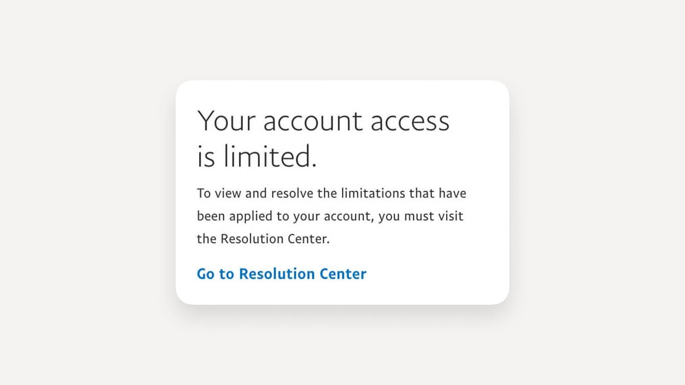
PayPal, when account limitations kick in, shows a notice with a button leading to the Resolution Center — a dedicated section inside the account that lists the steps for the specific case and sets out timelines. The caveat is stated plainly too: the timeline depends on the complexity of the case. There's a neat side effect PayPal points out: if an email about a limitation arrives but the Resolution Center is empty, the email is fake.
The working technique: instead of a specific explanation, give a general one — moved into a separate document that the screen links to.
How to measure trust
Indirect signals work:
- The share of first transactions for the minimum amount (users make a test transaction);
- Support requests along the lines of "did the money definitely arrive?";
- The share of customers who keep minimal balances in the service;
- Drop-off on the confirmation screen rather than on the data entry screen (the user got to the end and changed their mind).
And the absence of complaints and support questions says nothing about trust.
What to do in practice
Before taking a new flow into work, it's worth understanding:
- At what point does the user see the total cost with all components, fees and exchange rates?
- Which features of the service are built against revenue — and are they product requirements?
- What do the warning blocks and screens look like, and what happens to liability if the user ignores them?
- What does the user see if a transaction is stopped for a reason that can't be named?
- How does communication work when a failure is the service's fault?
A trust check-up for live flows:
- Walk through the whole flow and check whether the amount on the entry screen matches the amount on the confirmation screen. A discrepancy at any step is a point of lost trust, even if it's disclosed;
- Check where in the product the legal status of money changes — between accounts, wallets, savings and investment products — and whether this is reflected on the screen where that money is shown;
- Count all the warnings in the flow and estimate the share of false positives — that share determines whether the ones that fire for good reason get read;
- Copy explaining a refusal, block or delay should be written in advance and reviewed by legal — users read these screens more closely than any others;
- Trust metrics shouldn't come down to surveys and support volume.
Trust is built where the service acts against its own interest:
- It names a price it would be more profitable not to name;
- It blocks a transaction it earns money on;
- It stops where pushing further would be easiest.